Top 5 Interior Paint Colors Trending in Overland Park Homes Right Now
Looking to refresh your space this year?
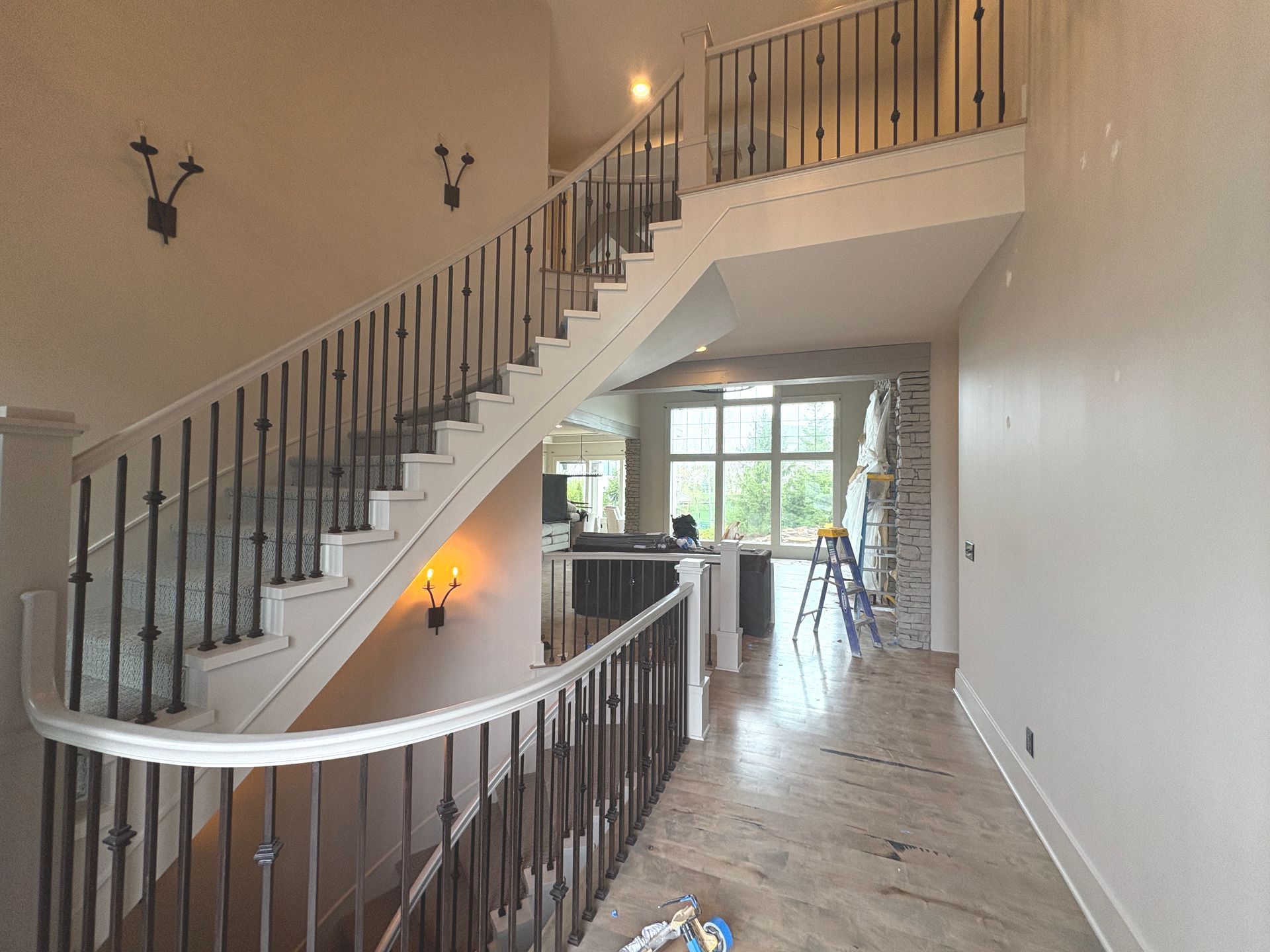
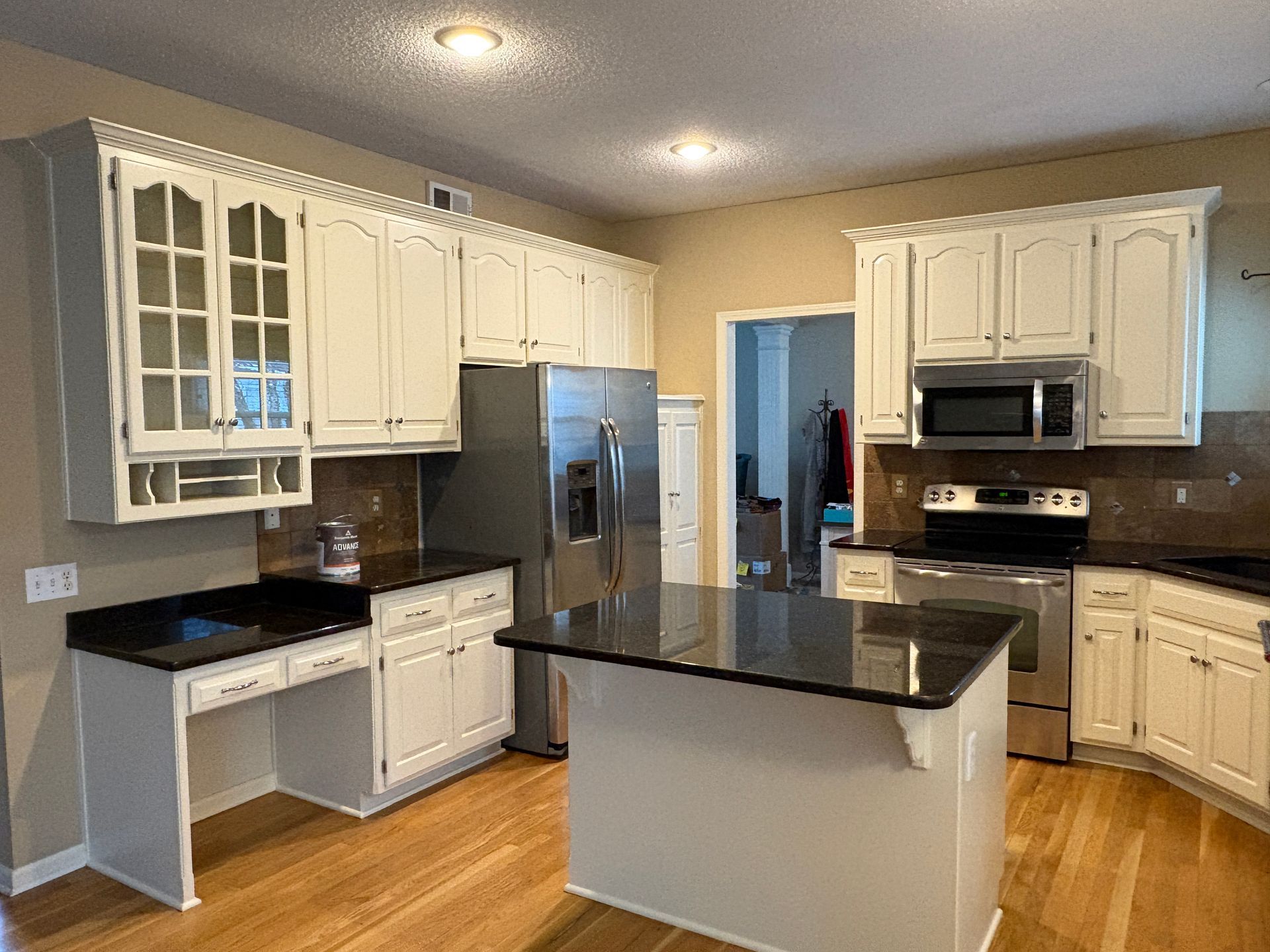
Spring is here, and more and more homeowners in Overland Park are giving their interiors a fresh coat of personality. We’ve been inside dozens of homes lately, and there's a clear trend: cozy, calming, and personality-packed paint colors are in.
Whether you're updating a single room or rethinking your whole interior, here are the top 5 paint colors Overland Park homeowners are loving right now.
Greige Everything
Not quite gray, not quite beige—greige is the versatile, neutral superstar that continues to dominate in Overland Park. Homeowners love it because it plays well with warm wood floors, cool stone countertops, and just about any decor style.
✅ Pro Tip: Greige looks best in rooms with a mix of natural and artificial light. Test it on multiple walls before committing!
Soft Sage & Dusty Green
Green is having a major moment, and it’s not the bold, kelly kind. We’re seeing a ton of soft sage, eucalyptus, and dusty olive shades—especially in living rooms, bedrooms, and bathrooms. These colors bring a calming, organic vibe that works beautifully in Overland Park’s light-filled suburban homes.
✅ Pro Tip: Pair sage tones with natural wood, warm whites, and soft textures for a cozy, grounded look.
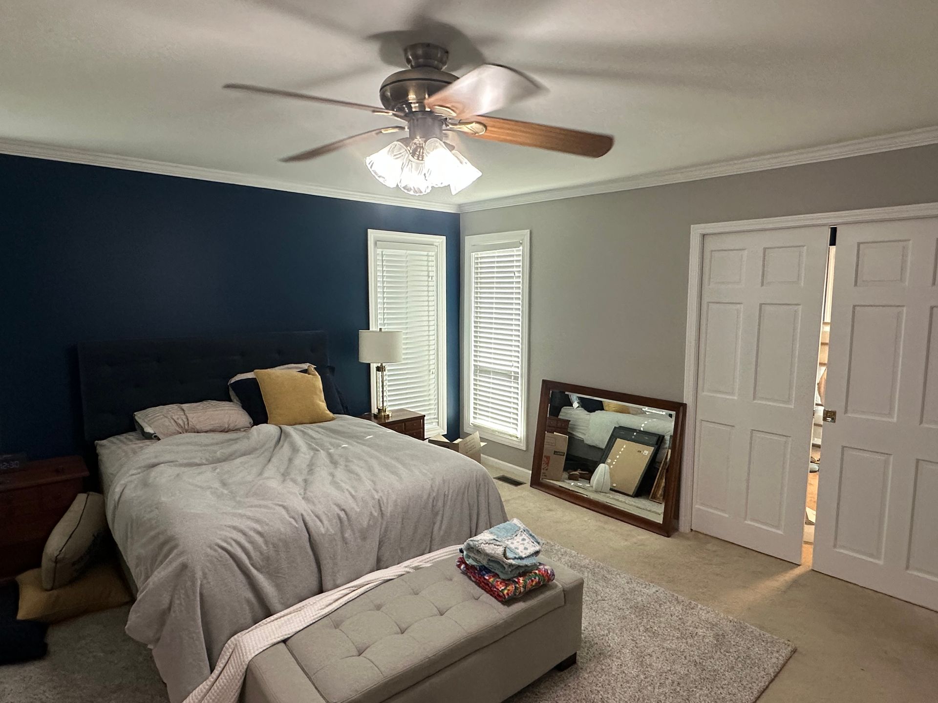
Deep Navy Accents
Looking to add a little drama without going overboard? Navy blue is your best friend. It’s showing up in home offices, dining rooms, and especially on feature walls and built-ins. Paired with crisp white trim and warm metallics, it’s a classic color that feels bold but not too risky.
✅ Pro Tip: Navy works best in rooms with good lighting—natural or artificial. Want to make a statement? Try it on cabinetry.
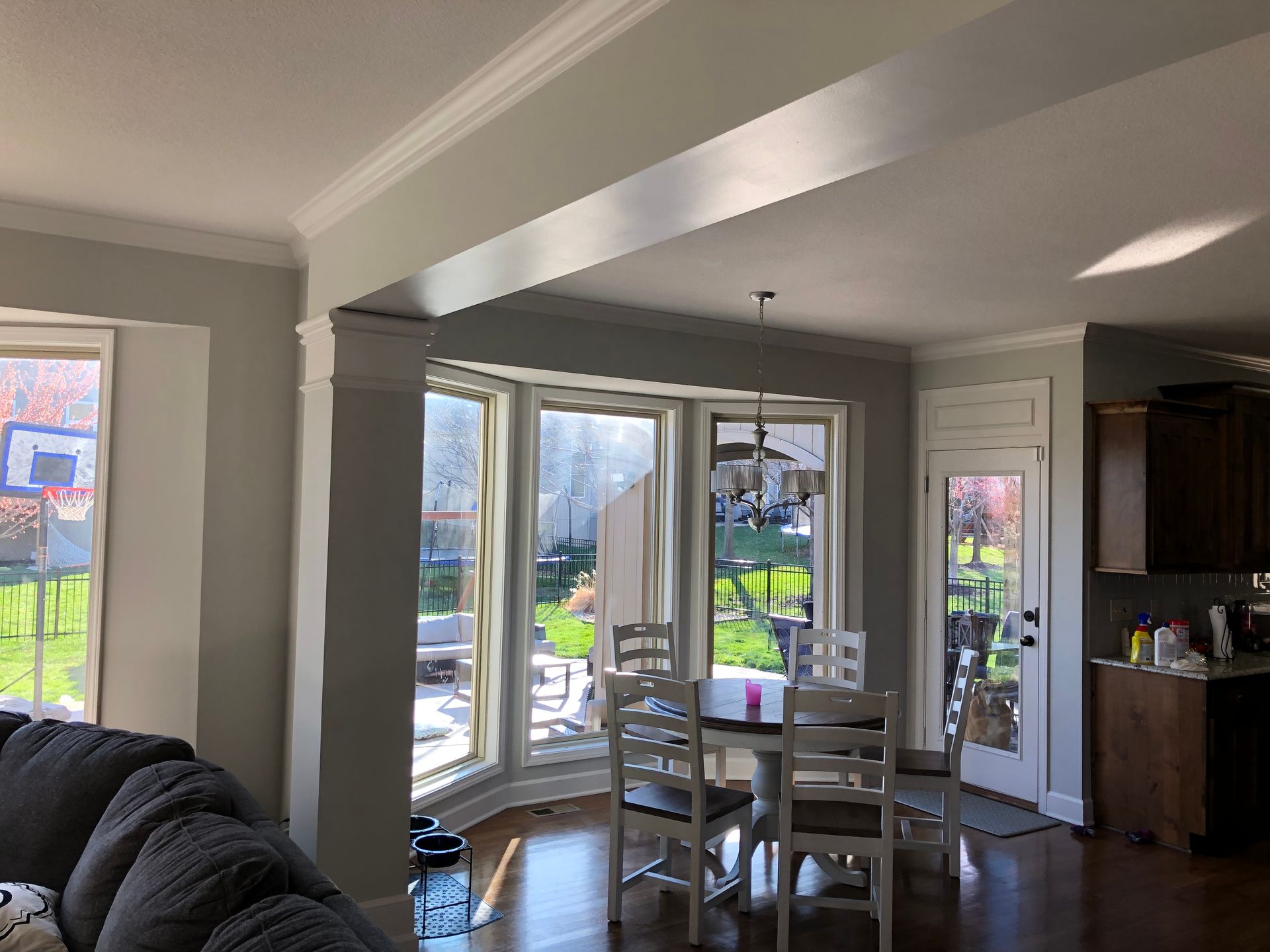
Warm White Walls
Yes, white walls are still in—but not the stark, sterile whites of the past. Warm whites with subtle undertones are trending big time in Overland Park. They bounce light beautifully, make spaces feel open and airy, and act as the perfect backdrop for art, plants, and texture-rich furniture.
✅ Pro Tip: Pair warm whites with soft beige or greige trim for a high-end designer feel that still feels homey.
Muted Terracotta & Clay Tones
This one's for the bold-but-earthy crowd. Burnt orange, clay, and muted terracotta are sneaking into accent walls, cozy nooks, and even powder rooms. These tones add a grounded, natural warmth that feels modern and just a little boho.
✅
Pro Tip:
Clay tones pair beautifully with white, olive green, or navy accents—great for creating layered, earthy color palettes.

Ready to Paint Your Perfect Space?
Whether you’re color-confident or totally overwhelmed by swatches, we’re here to help. At LAK Painting, we offer free consultations, honest advice, and a process designed to put your needs first.
Let’s find the color that fits your style, your space, and your life.
Get a Free Quote or call us at
(913) 333-8286.